UX/UI design
competitive analysis, user personas, application map, logo and branding,
style tiles, mobile app screens, UI kit
Pulseband is a healthcare concept wearable that monitors and measures a user’s blood pressure, heart rate, steps, sleep patterns and other vitals. The wristband notifies the user of alarming heart patterns through color change and app functionality.
Our challenge for this project was to conduct user research to identify usage trends and priorities from the user's perspective. We needed to discover which methods of accountability were most effective. Then we needed to design and develop a mobile phone app based off of those methods.
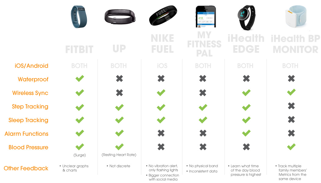
My team and I synthesized the data from our competitive analysis and user interviews in order to create user personas and a product appplication map.
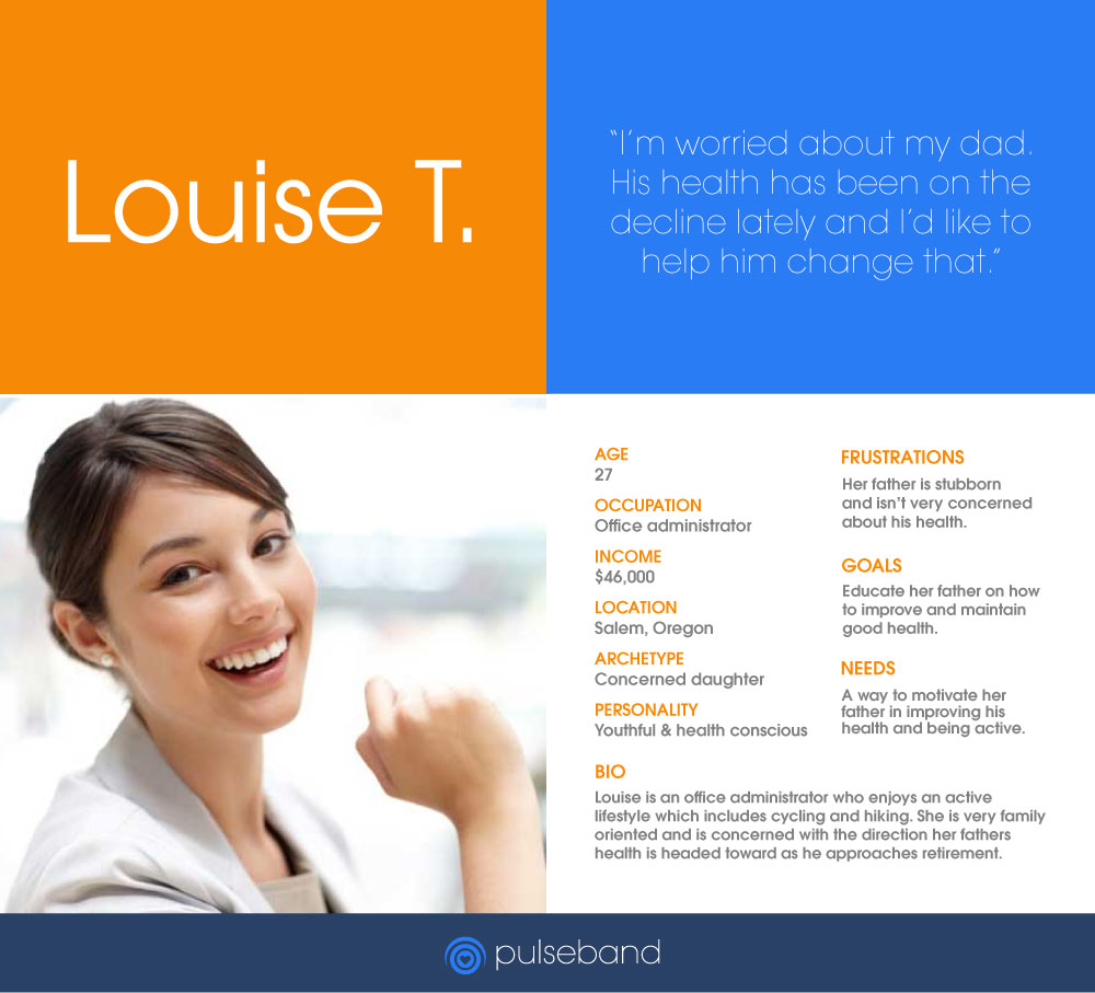
These are the personas I created to guide me through the storyboards and scenarios.


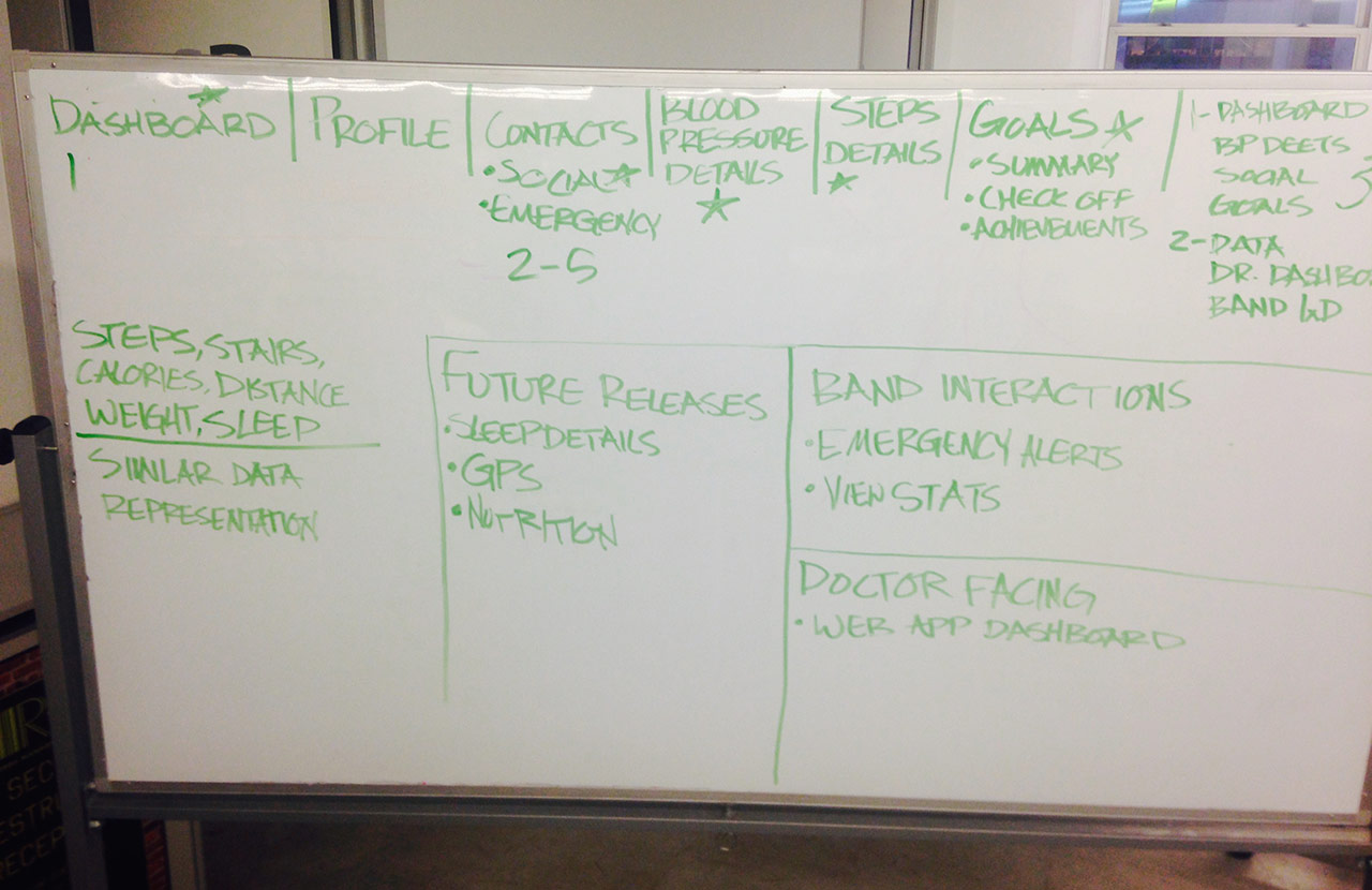
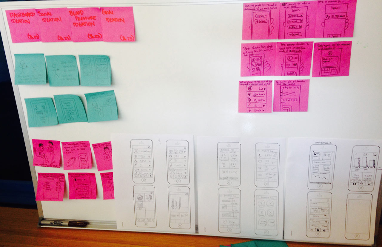
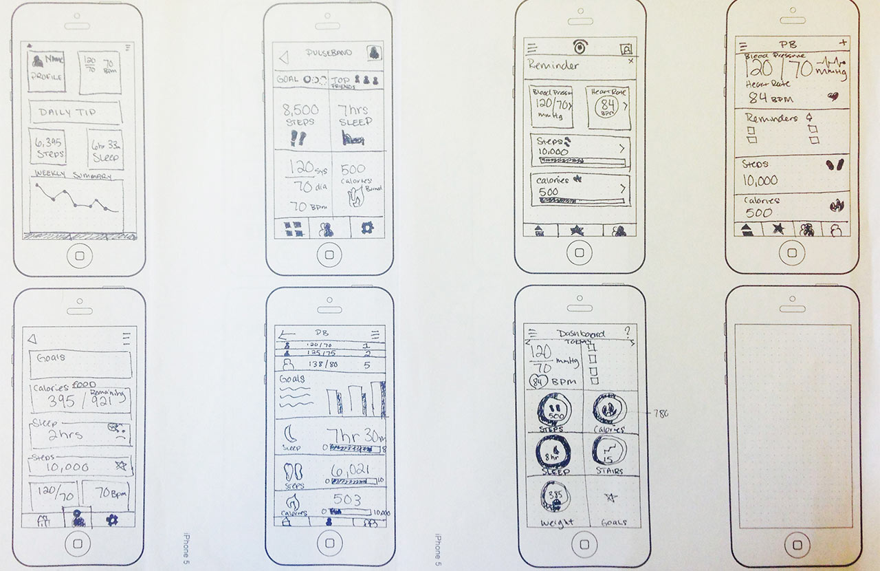
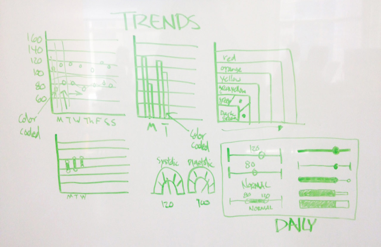
In my role as UI/visual designer, I designed the pulseband logo along with the UI kit. I experimented with different logo designs and executed different style tiles based on our design direction. I also developed key screens and the data visualization for important health metrics.
We took a simple and easy to navigate direction. Our goal was to keep the navigation between screens to three taps or less. We wanted to it to be approachable, practical, and trustworthy. We also wanted it to be comprehensive and meaningful data through actionable insights. We wanted the user to utilize social connection and interaction to increase motivation. Our overall goal was to simplify the process in maintaining a healthy lifestyle change.
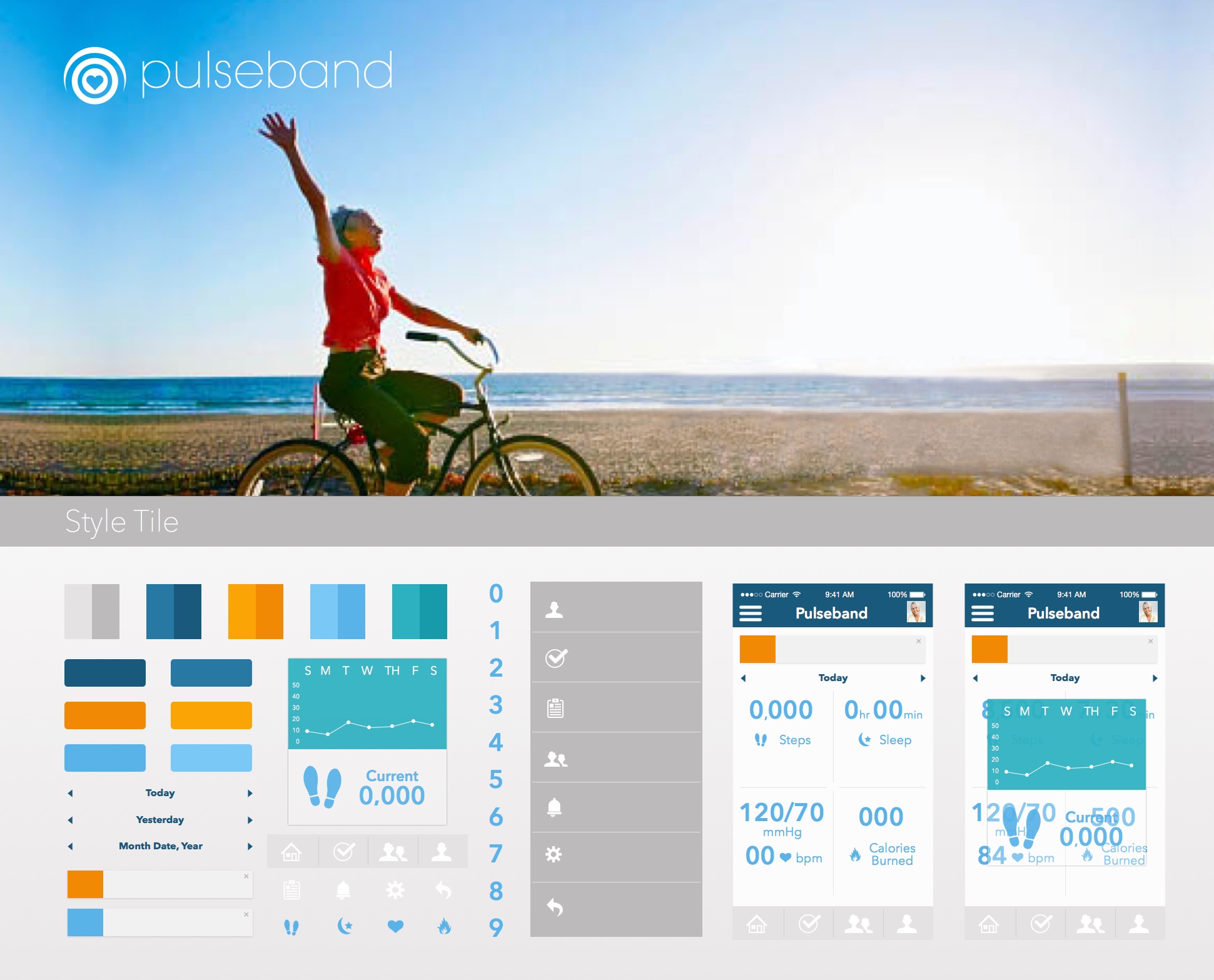
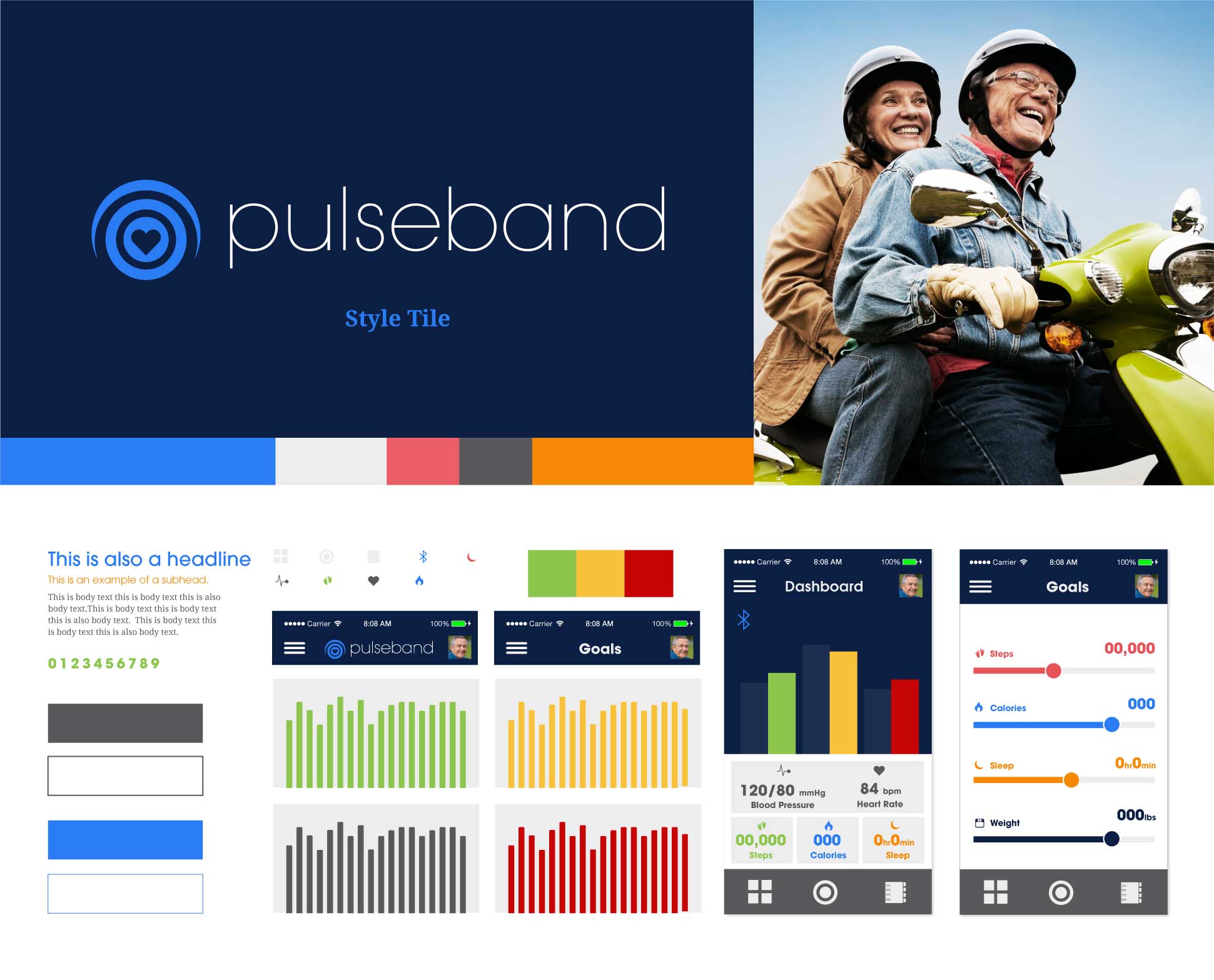
Below are the high fidelity mock ups I created based off of the wireframes. They take the user from the login screen through the process of setting up a daily goal and medication reminders. They also include the data visualization for the user's blood pressure and steps taken.